GCTC is elevating the horse racing & entertainment experience.
The objective was to create a more intuitive and user-friendly experience without delving into UI and graphic design. Through meticulous planning and collaboration, our product design studio successfully restructured GCTC’s website, ensuring a robust and user-friendly framework ready for UI and graphic design implementation. Our efforts have laid the groundwork for an exceptional digital presence that aligns with GCTC’s business objectives.
Scope
Improve website’s layout, ensure optimal user flow, incorporate interactivity for user engagement
Deliverables
Comprehensive wireframes with micro-interactions and detailed prototype
Impact
Enhanced navigability, ensuring users find the information they need quickly and efficiently
Outcome
To be determined after the launch in August 2024
Home Page
Before

The homepage lacked cohesiveness, the money shot
- The homepage menu was cluttered with logo, categories, search bar and icons.
- The campaign posts were boring with only rectangles and grid square.
- There was no personalisation and product recommendations available for users.
After

The homepage was monotonous and saw a lot of drop offs as the content was not engaging.
- The homepage menu was cluttered with logo, categories, search bar and icons.
- The campaign posts were boring with only rectangles and grid square.
- There was no personalisation and product recommendations available for users.
Homepage Interactions
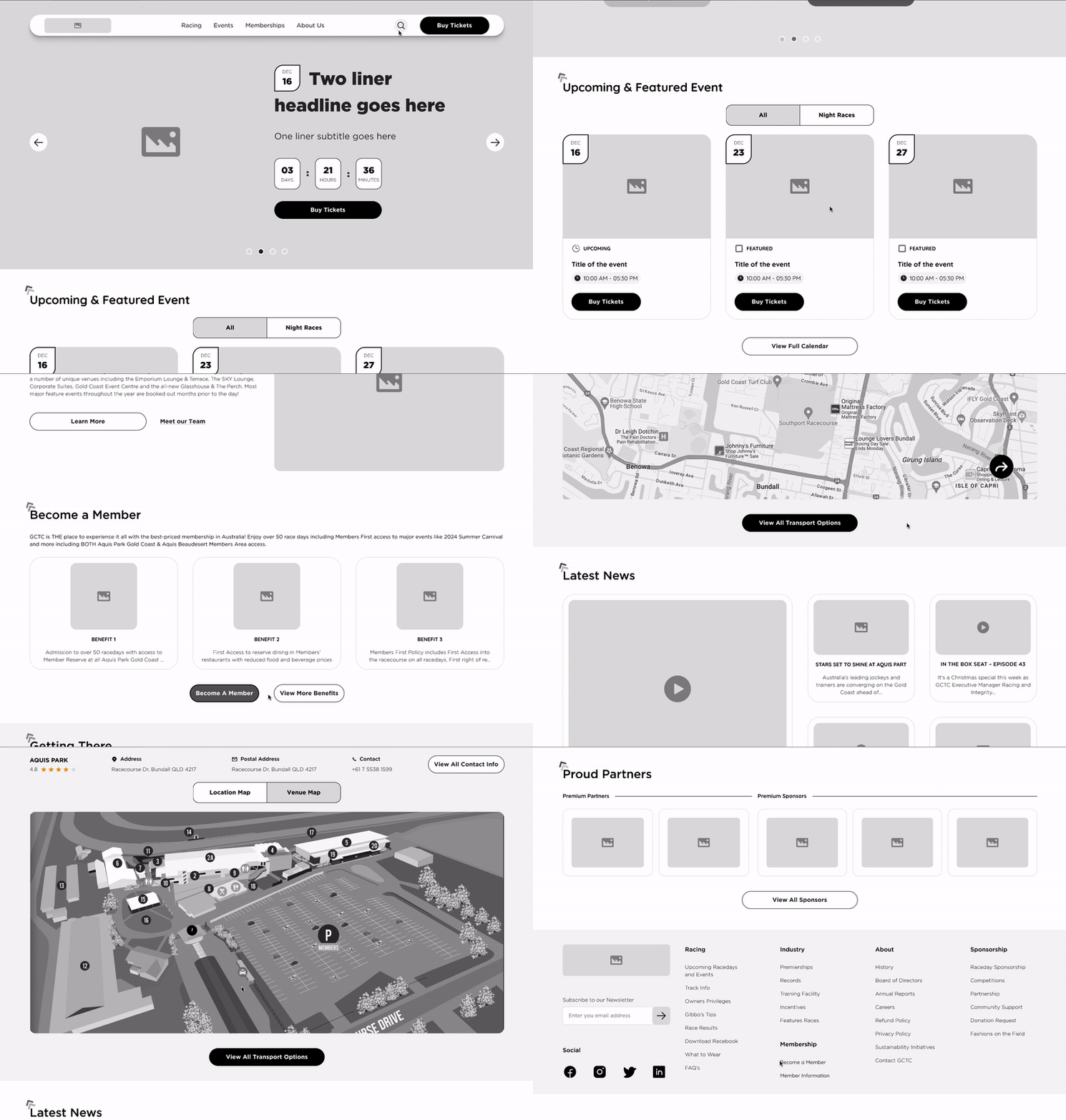
Racing
Before
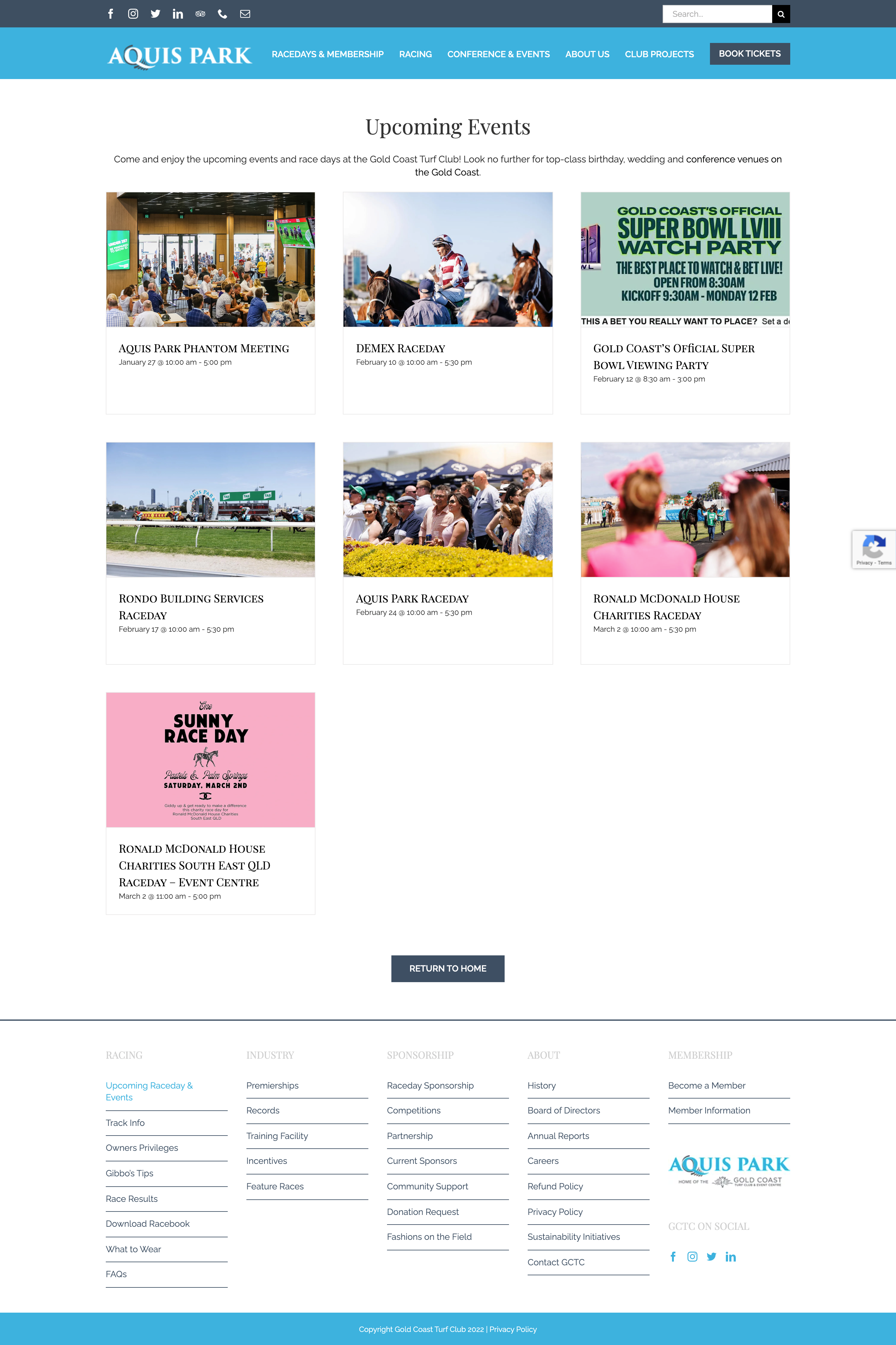
The homepage was monotonous and saw a lot of drop offs as the content was not engaging.
- The homepage menu was cluttered with logo, categories, search bar and icons.
- The campaign posts were boring with only rectangles and grid square.
- There was no personalisation and product recommendations available for users.
After

The homepage was monotonous and saw a lot of drop offs as the content was not engaging.
- The homepage menu was cluttered with logo, categories, search bar and icons.
- The campaign posts were boring with only rectangles and grid square.
- There was no personalisation and product recommendations available for users.
Events Booking
Before
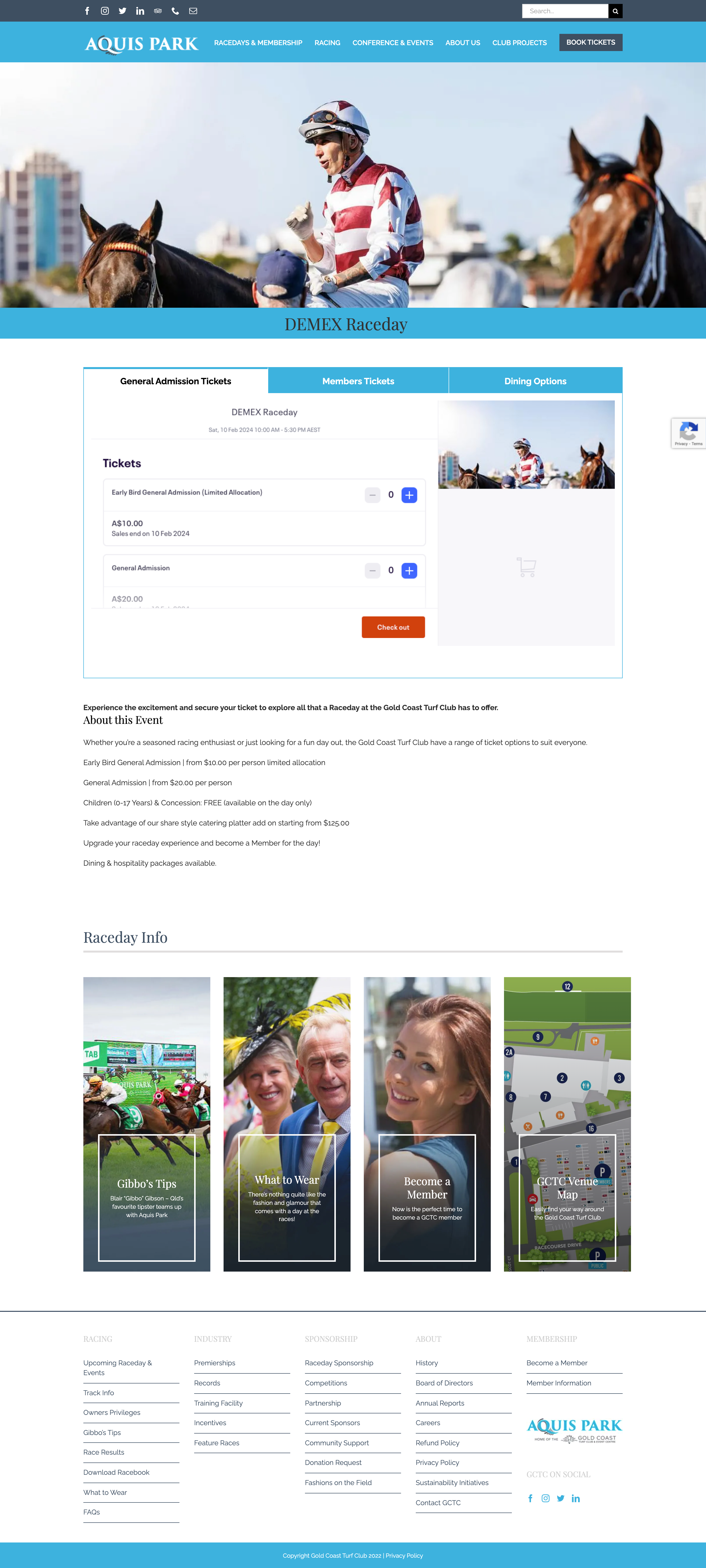
The homepage was monotonous and saw a lot of drop offs as the content was not engaging.
- The homepage menu was cluttered with logo, categories, search bar and icons.
- The campaign posts were boring with only rectangles and grid square.
- There was no personalisation and product recommendations available for users.
After
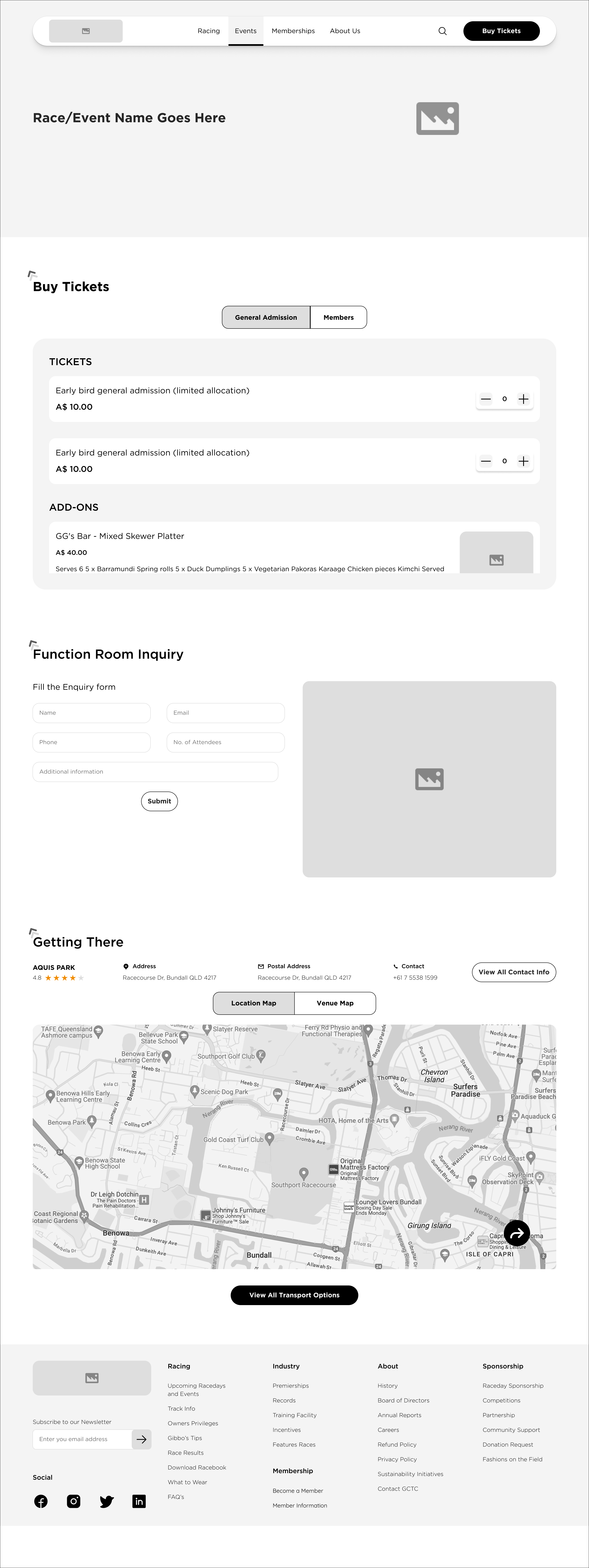
The homepage was monotonous and saw a lot of drop offs as the content was not engaging.
- The homepage menu was cluttered with logo, categories, search bar and icons.
- The campaign posts were boring with only rectangles and grid square.
- There was no personalisation and product recommendations available for users.
Memberships
Before

The homepage was monotonous and saw a lot of drop offs as the content was not engaging.
- The homepage menu was cluttered with logo, categories, search bar and icons.
- The campaign posts were boring with only rectangles and grid square.
- There was no personalisation and product recommendations available for users.
After

The homepage was monotonous and saw a lot of drop offs as the content was not engaging.
- The homepage menu was cluttered with logo, categories, search bar and icons.
- The campaign posts were boring with only rectangles and grid square.
- There was no personalisation and product recommendations available for users.
About Us
Before
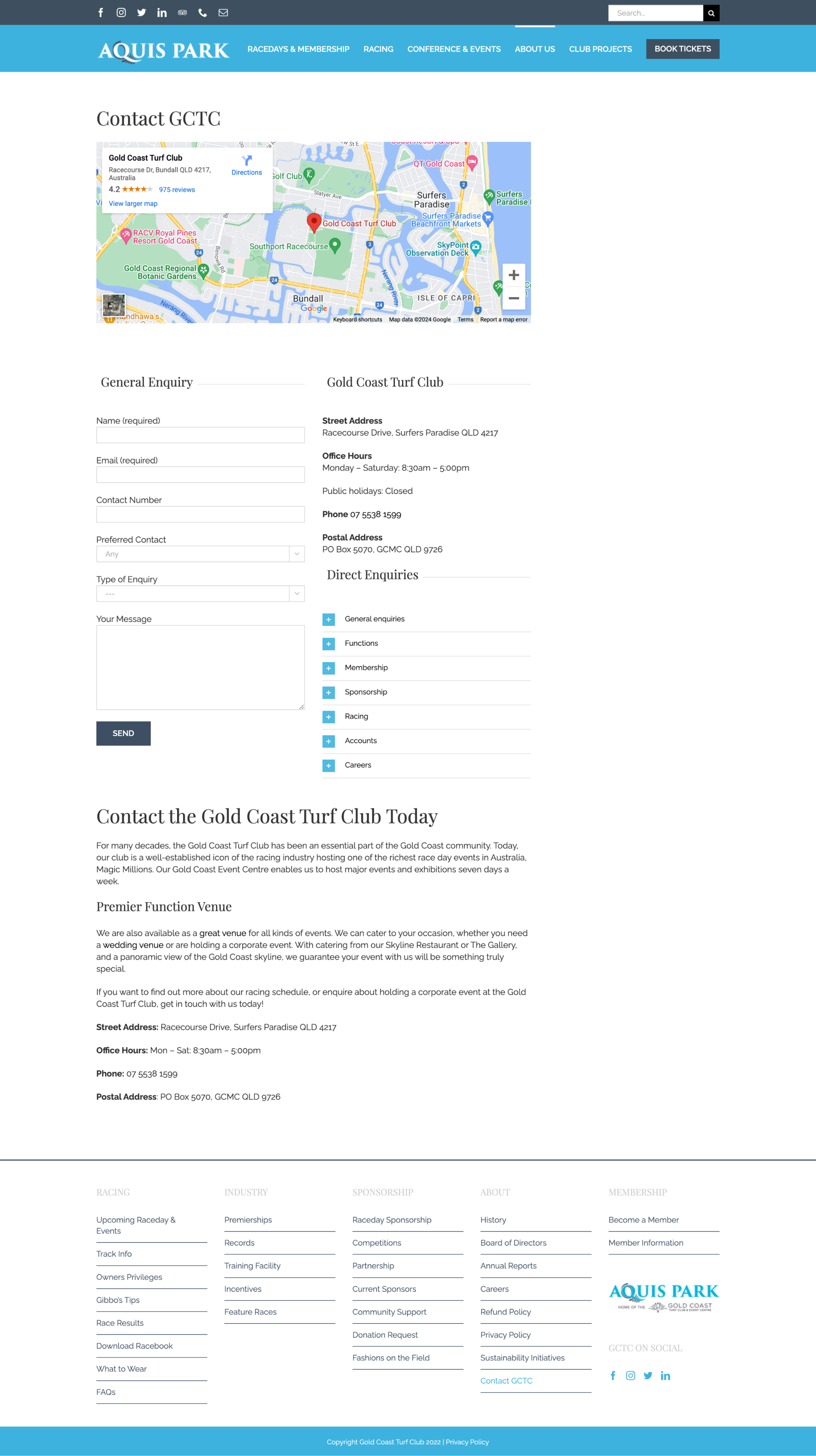
The homepage was monotonous and saw a lot of drop offs as the content was not engaging.
- The homepage menu was cluttered with logo, categories, search bar and icons.
- The campaign posts were boring with only rectangles and grid square.
- There was no personalisation and product recommendations available for users.
After

The homepage was monotonous and saw a lot of drop offs as the content was not engaging.
- The homepage menu was cluttered with logo, categories, search bar and icons.
- The campaign posts were boring with only rectangles and grid square.
- There was no personalisation and product recommendations available for users.