We took on the exciting challenge of redesigning ZALORA’s website with the aim of boosting user engagement and conversion rates. Our goal was to create a modern, contemporary look and feel for the site, making it more appealing and user-friendly.
Home Page
Before

The homepage was monotonous and saw a lot of drop offs as the content was not engaging.
- The homepage menu was cluttered with logo, categories, search bar and icons.
- The campaign posts were boring with only rectangles and grid square.
- There was no personalisation and product recommendations available for users.
After
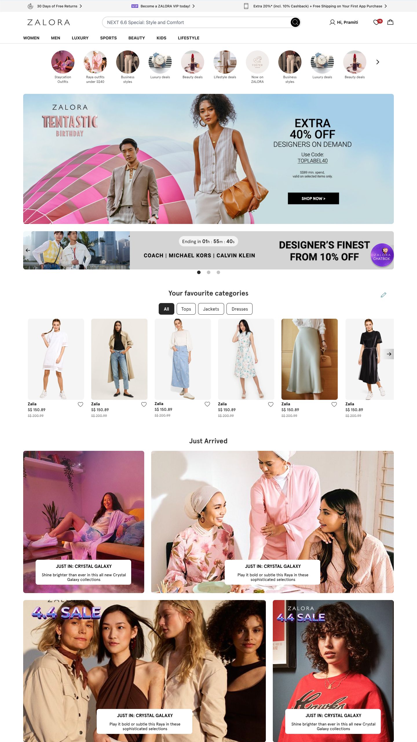
The new homepage had a clean and minimal look. New engaging post types were added.
- Emphasis on search bar was given with categories on separate row
- New layouts for campaigns were added for a dynamic look, like bubble post, 1:2 ratio, etc.
- Personalisation like username and product recommendations were added.
25%
Increase in search usage
12%
Increase in CTR to Campaign page
15%
Reduction in drop-off rate
US$ 45K
Per month uplift in NMV
Product Listings Page
Before
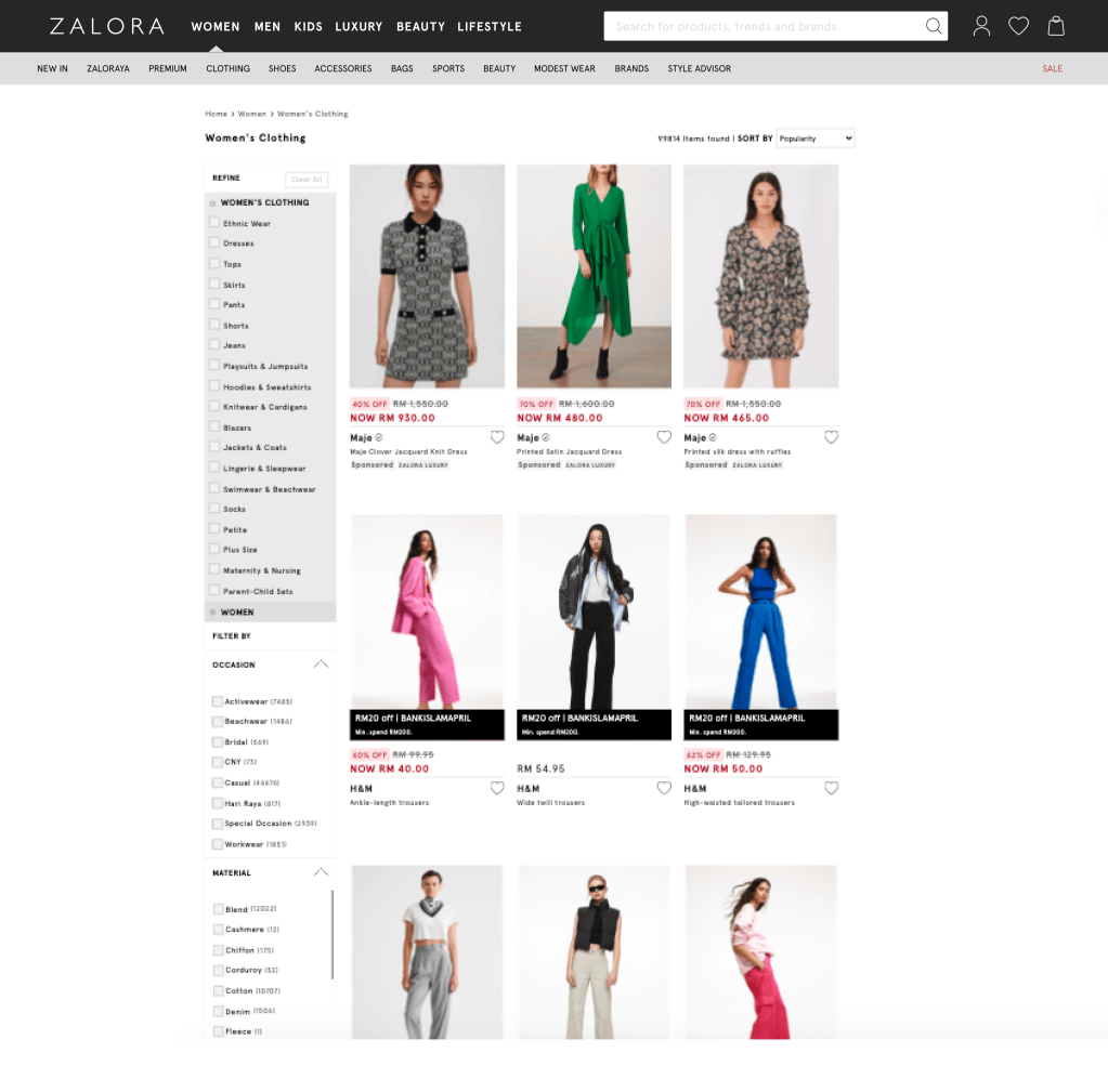
The product listings page was old-fashioned and cluttered causing users to abandon their shopping sessions.
- The product listings page was old-fashioned and cluttered.
- Users found it difficult to apply filters and sort products.
- The page lacked a clear structure. Important details like product names, prices, and sorting options were not easily accessible.
After
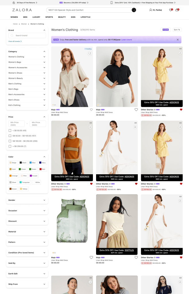
The new product listings page had a Modern and Clean Design.
- Prioritised a clean layout to highlight key information such as product names, images, prices, and sorting options.
- Users could easily find product names, prices, and sorting/filtering options, making product comparison straightforward and efficient.
- We made important details easy to see, so users could review their items and checkout confidently.
15%
Decrease in bounce rates
5%
Conversion rate improved
+110% growth
new Filter and Sort design
US$ 58K
Per month uplift in NMV
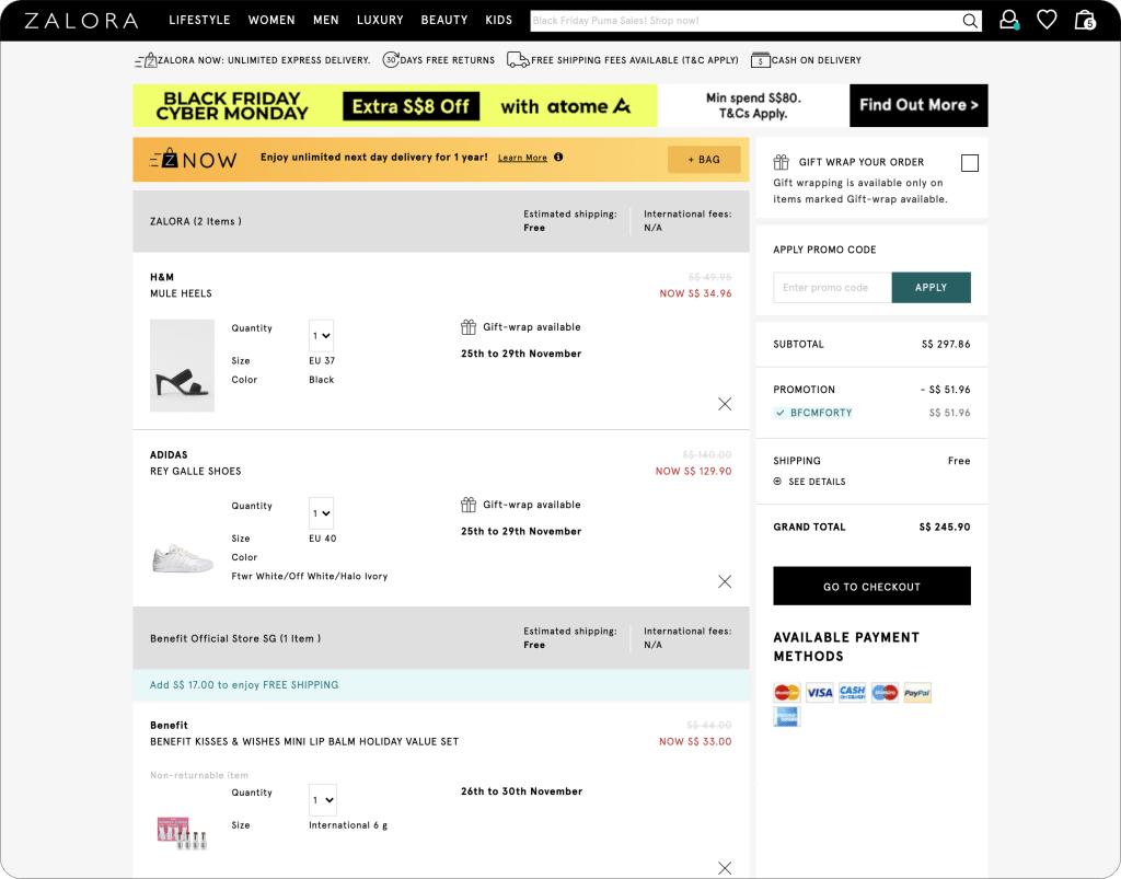
Cart
Before
The Cart was outdated, lacked structure and it was hard to find relevant information that led to lot of abandonements.
- Parity with Zalora app.
- The website was not optimized for different devices, leading to frustration and drop-offs.
- Lacked hierarchy of information which made it difficult for users to review their selections and make informed decisions
After

The new Cart had a clean and minimal look.
Address was added to Cart to get accurate delivery information.
- We updated the cart with a modern look, ensuring it was visually appealing and easy to navigate.
- Aligned the web cart’s design and functionality with the Zalora app.
- We made important details easy to see, so users could review their items and checkout confidently.
